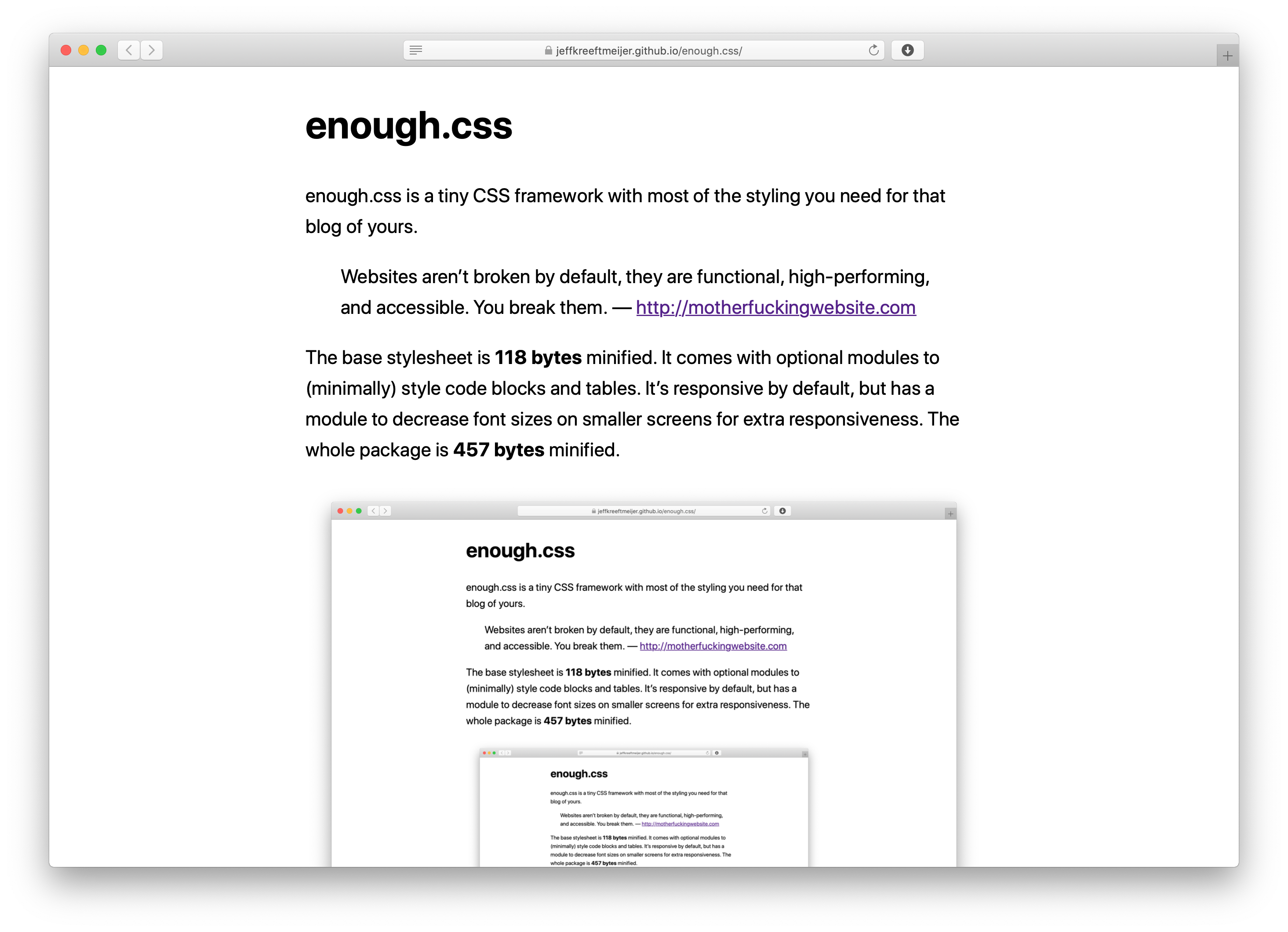
enough.css is a tiny CSS framework with most of the styling you need for that blog of yours.
Websites aren’t broken by default, they are functional, high-performing, and accessible. You break them. — http://motherfuckingwebsite.com
The base stylesheet is 183 bytes minified. It comes with optional modules to (minimally) style code blocks and tables. It’s responsive by default, but has a module to decrease font sizes on smaller screens for extra responsiveness. The whole package is 478 bytes minified.
It’s an experiment to see how little CSS a blog can get away with while still looking good and being readable on big and small screens.
It styles pages without having to add extra markup like wrapper <div>s and CSS classes.
Besides the base style sheet, it comes with modules for styling specific tags.
These are included in enough.min.css by default, but you can build your own to save some bytes if your project doesn’t need everything.
Some of the rules are duplicated across modules so they don’t depend on each other, but cssnano takes them out when minifying.
system-ui if available, or falls back to a sans-serif fontline-heightmax-width to images and videos, so they can’t overflow.auto to resize proportionally when width and height are setsmaller font-size in <pre> tagsui-monospace (which is SF Mono on Safari ≥ 13.1), SFMono-Regular (SF Mono on Chrome) or Monaco as the font in <pre>, <code>, and <kbd> tags, or falls back to the system’s monospace font<pre> tags so long lines show horizontal scroll bars<pre> tagsghostwhite background color to <pre> tags| Maximum viewport width | Body font size | Max. viewport calculation |
|---|---|---|
| 1140px | 20px | (35em + 2em) × 22px × 1.4 |
| 740px | 18px | (35em + 2em) × 20px |
| 466px | 16px | (35em + 2em) × 18px × 0.7 |
width to tables.$ npm install
$ cat enough.css enough.media.css enough.code.css enough.table.css | node_modules/.bin/cssnano > enough.min.css